
Focusing on the entire UX process to redesign a well-loved website.
northern pines
third year
website UI/UX case study
3 months

This project is a class-assigned case study to evaluate and improve the usability of Northern Pines's website, a diner located in Flagstaff Arizona.
research
user insights
ideation
testing
defining the problem
user research
user interviews
user personas
heuristic evaluation
information architecture
user flow
usability testing
collecting feedback
design
wireframeing
prototypes
visual design

defining the problem
After looking through the Northern Pines website,
I identified potential pain-points through the planes.

STRATEGY
scope
structure
skeleton
surface
In general, it satisfies all the things that a user might need to find.
The Gallery page is a bit unnecessary or doesn't need to be featured in the navigation bar.
Nav Bar's information architecture could be helped:
-
its too cluttered, some of those features do not need to be featured and could be in a drop-down menu instead (Gift Card Balance, Employment, etc)
-
"Become a VIP" and "Sign In" could be combined
All website functions operate out of the navigation bar at the top which makes the site journey easy after you get over the initial overwhelmed feeling
Aesthetic changes could be made:
-
Font choice: thin and small, which makes it inaccessible to many users
-
Text: too small and text hierarchy is off on the menu
-
Pictures on some menu items, not all
-
review buttons seem a little out of place
Overall, the website is pretty easy to use. But it did make the user think before interacting, which can be improved on. The site has a clear theme that they keep throughout and reflects a dinner and keeps the user's trust.
defining the problem
Unfortunately, we did not have access to the website's analytic data. I moved ahead by surveying to single out the potential user groups.
A brief summary of what was found:
19-24

most users were:
years old

most users highest level of education was:
bachelors
or on track to earn a bachelors degree
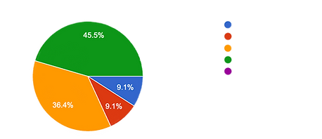
How comfortable are you when using the internet?

Very rarely (0-1 hours)
Rarely (2-5 hours)
Moderately (6-7 hours)
Often (8-10 hours)
Very Often (10+ hours)
How often do you use the internet per day?
(approximately)
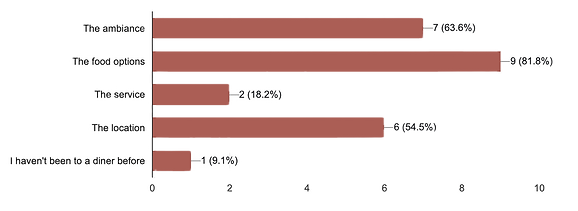
What is your favorite part of the Diner experience?

user personas
The data yielded two main user types:


iii. card sorting
10 participants engaged in open card sorting with the following:


preliminary site map
Based on information gathered from the card sort.

I chose to use a heirarchical structure as that is what’s most comfortable to the average user, and easiest way to organize the vast amount of information on the site.
Rather than adding new terminology, this situation needs to reduce the categories (as seen here). Card sorting showed that the terminology already being used is understandable.

brand realignment
Most users said that one of the biggest issues that hindered the usability of the site was its current aesthetics.


final mockups


